Schumann Resonances and Ionospheric Alfvén Resonances
An induction coil (or high frequency magnetometer) consists of coils of insulated copper wire wound around an iron core. Their large size and thousands of loops makes them sensitive to the very rapid changes of the magnetic field at frequencies between 0.1 and 1000 times per second. This part of the electromagnetic spectrum is called the Extremely Low Frequency (ELF) range. BGS have been running two such instruments since 2012 at Eskdalemuir. These instruments are very sensitive to rapid magnetic field variations but cannot be used for long-term or absolute measurements.
Between 1 and 50 Hz there are a number of natural resonance phenomena detectable, generated by the reflection/refraction of electromagnetic waves between the Earth's conductive surface and the upper atmosphere (called the ionosphere). These resonances are known as the Schumann Resonances and Ionospheric Alfvén Resonances (IARs). IARs are magnetic field vibrations (i.e. waves) in the range from around 0.5 to 20 Hz. At middle and low latitudes they are produced, indirectly, by the leakage of energy from lightning strikes into near-Earth space. They have tiny amplitudes in the picoTesla (pT) range and can only be detected on Earth's surface using search coil magnetometers. Occasionally, magnetospheric pulsations between 1-10 Hz can be seen. These tend to occur a day or two after large geomagnetic storms.
Raw data from the BGS induction coils are processed using a modified Fast Fourier Transform (FFT) technique to create one-dimensional "Welch" periodograms. These convert time-series to the frequency domain so the repeating patterns can be identified. Multiple periodograms are then stacked into a matrix that can be visualized as a spectrogram.
Finding the resonances


Contrary to popular belief, the Schumann Resonances are actually quite hard to detect. It generally requires the accumulation of a few minutes of data in order to extract them via a Fourier Transform. Figure 1 shows an example of five seconds of recordings (with 100 points per second) from the 3rd December 2013 at a couple of different times during the day. The data are taken directly from the digitiser (hence digital units on the y-axis) before being later calibrated into SI units. The lines have been offset from zero for ease of visualisation. It is not easy to determine by eye if there are any resonances in the data. It is only when these time-series are FFT-ed, that the repeating patterns (resonances) begin to appear. Hence most magnetic measurements essentially look like noise.
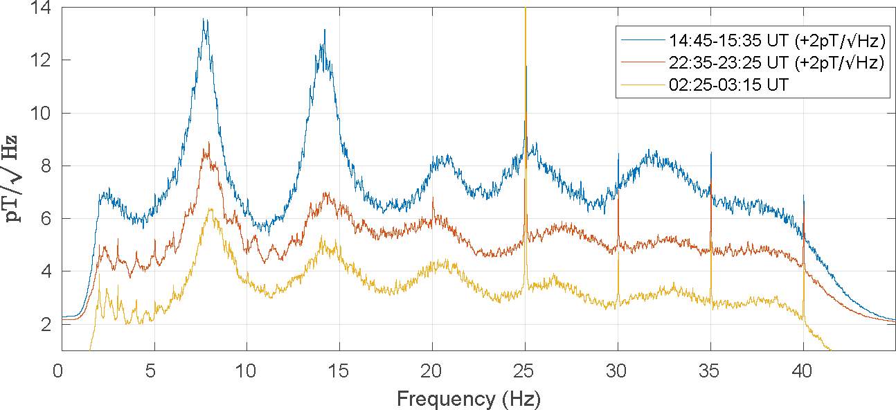
Figure 2 shows three periodograms created using fifty (50) minutes of data. The figure shows a measure of energy versus frequency. The time-series data are initially band-passed to remove long periods (due to external field magnetic activity) and the very shortest periods (to remove aliasing). The lines in the plots roll-off below 3 Hz and above 40 Hz because of this filtering. The Schumann resonances now appear as rather broad features, with the first peak around 8 Hz but width of ±2 Hz; the second resonance is at 14 Hz and the third around 21 Hz. The higher resonances become smaller and broader. In addition, the peak values of each resonance are not constant during the day and do change continuously.
There are other features such as the 25 Hz peak and other peaks on the 5 Hz integer values. These are sub-harmonics and mathematical aliasing of the 50 Hz oscillations of the UK electrical grid. The afternoon curve (blue) is most energetic while the night time curve (orange) is least energetic. This is related to the distance from the source regions to Eskdalemuir (that is, Asia in the morning, then Africa in the afternoon and America in the evening) as well as the intensity of each source.
Finally, note the very small bumps visible between 2 Hz and 12 Hz on the red curve and 2 Hz and 7 Hz on the orange curve. These are the Ionospheric Alfvén Resonances. If we take 100 seconds of data, rather than 3000 seconds (i.e. 50 x 60) shown in Figure 2, then we can split the day into 864 slices (as there are 86400 seconds per day). For each 100 seconds of data, we can compute a periodogram, then stack them into a matrix and visualise it. The result is called a spectrogram (Figure 3) and is a plot of time against frequency with the brightness indicating intensity. This spectrogram starts at midday on the 2nd and stops on noon on the 3rd of December. It neatly displays both the Schumann Resonances and the IARs. The SR are the bright fuzzy vertical lines at 8 Hz and 14 Hz with further less clear resonances at 21, 26, 33 and 38 Hz. The IARs appear around 18:00 UT between 2 and 5 Hz and then unusually appear out to almost 30 Hz between 22:00 and 00:00 UT. The 25 Hz line and its harmonics at 30 and 35 Hz are there too. The occasional horizontal bright line is due to a large regional lightning strike being picked up or data drop out noise from the digitiser.
Variation of SR over time
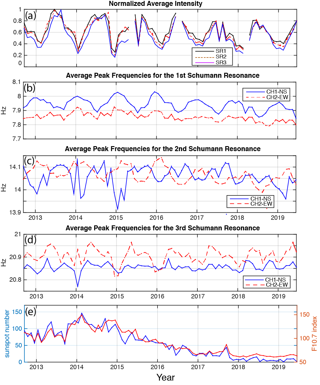
The Schumann resonances change over time and are affected by both seasonal and solar cycle effects. Figure 4 shows the computed monthly average values of the SR intensity and frequencies for the first three resonances, from September 2012 to August 2019. The top depicts the average monthly intensities for Channel 1 (North-South coil) and Channel 2 (East-West coil) combined. The normalized intensity (by the largest value in the time-series) of the combined channels for the first three Schumann resonances are shown by black, red and blue lines, respectively. There is a strong annual variation in intensity, with a minimum during winter and a maximum in summer and a clear reduction in the intensity over the declining phase of the solar cycle from 2014 to 2019 (see bottom panel).
The variations of the peak frequency of the first three SR are shown in panels b, c and d. The first resonance shows the highest values (> 8 Hz) in winter and lowest (< 7.9 Hz) in summer time. Both coils show the same pattern across 2012 to 2019 and there is an overall decline in peak frequency is visible from 2016 onwards. The second resonance demonstrates swapping of the peak frequency between the NS and EW coils, with the NS coil being higher in summer than the EW coil but lower in winter. For the third SR, the EW coil has the higher peak frequency, in general, from 2012 to 2019 compared to the NS coil. The bottom panel shows the sunspot number and F10.7 index, which are proxies for solar activity.
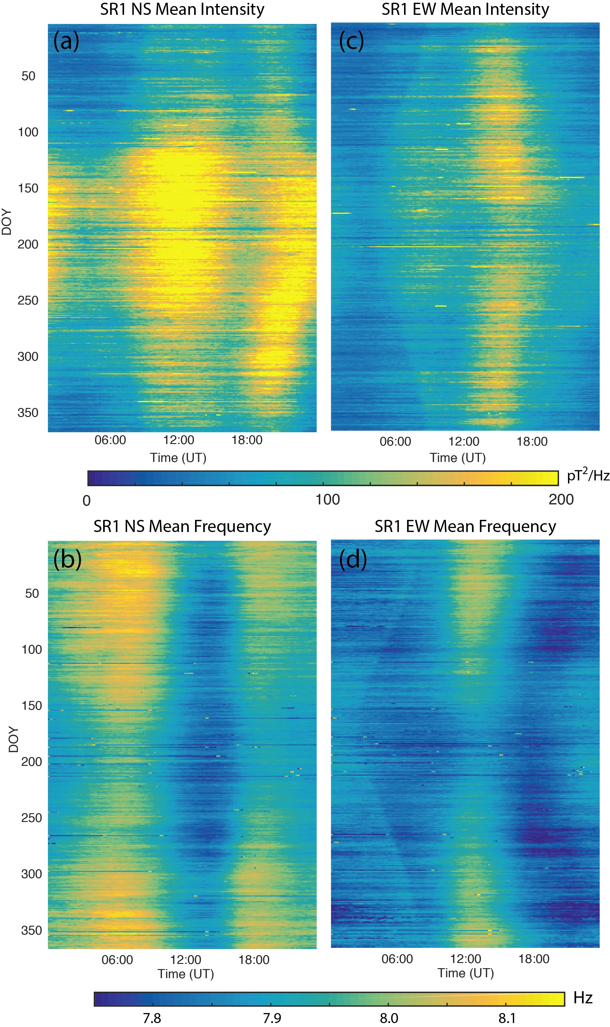
What is also interesting to look at is how the daily variations change over time. One way to do this is by making a day of the year versus Universal Time plot. Each day is divided into 144 slices (of 10 minutes), then the average value of the SR resonance's intensity and frequency is computed. We do this for every 10 minutes over a year and make a matrix of 144 by 365 values. To reduce the noise, we can do this over several years and average all the years together. This is shown in Figure 5. A number of unexpected patterns appear including the three main centres of lightning production in panel (a), the dawn terminator in panel (c) and (d) and the seasonal change in (b). The DoY-UT plots for the other two resonances are even more intriguing. If you are curious you can view them in this paper by Musur and Beggan (2019).
Occurrence statistics of IARs and pulsations
Investigation of the IARs in the Eskdalemuir data has been an active area of research since 2014. A first attempt was made to extract them automatically using signal and image processing techniques. Later, machine learning techniques have been used to improve the extraction of the IAR fringes. Before we discuss that, it is worth noting that IAR also follow the solar cycle and are strongly seasonal. They also do not appear during geomagnetic storms.
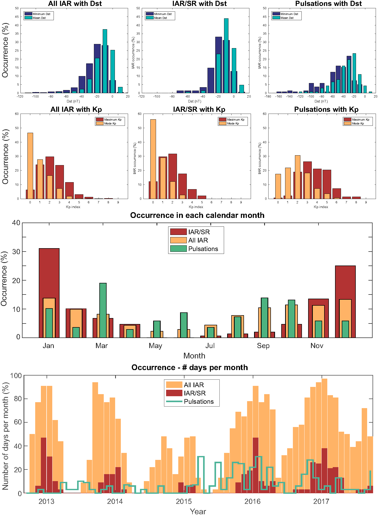
We manually picked out their occurrences and looked at how geomagnetically active it was. This is shown in Figure 6 where occurrence statistics are plotted. The upper panels show the occurrence with geomagnetic activity while the lower panels show occurrence with time. Geomagnetic activity is often measured using the Dst (Disturbed storm time) or Kp indices. A large negative value of Dst is a storm. However, Kp ranges from 0 to 9, so values above 6 are considered to be storm times.
Also shown is the occurrence of IARs that intersect SR (as shown in the spectrogram in Figure 3) and Pc1 pulsations which are a type of magnetospheric signal. Pulsations and IARs are somewhat anti-correlated, as one is driven by geomagnetic activity while the other is suppressed by it. The plot of each phenomenon's occurrence with time shows that pulsations are more common around the equinoxes while IARs appear in northern hemisphere winter more often. Further information can be found in Beggan and Musur (2018).
Machine Learning to extract IARs
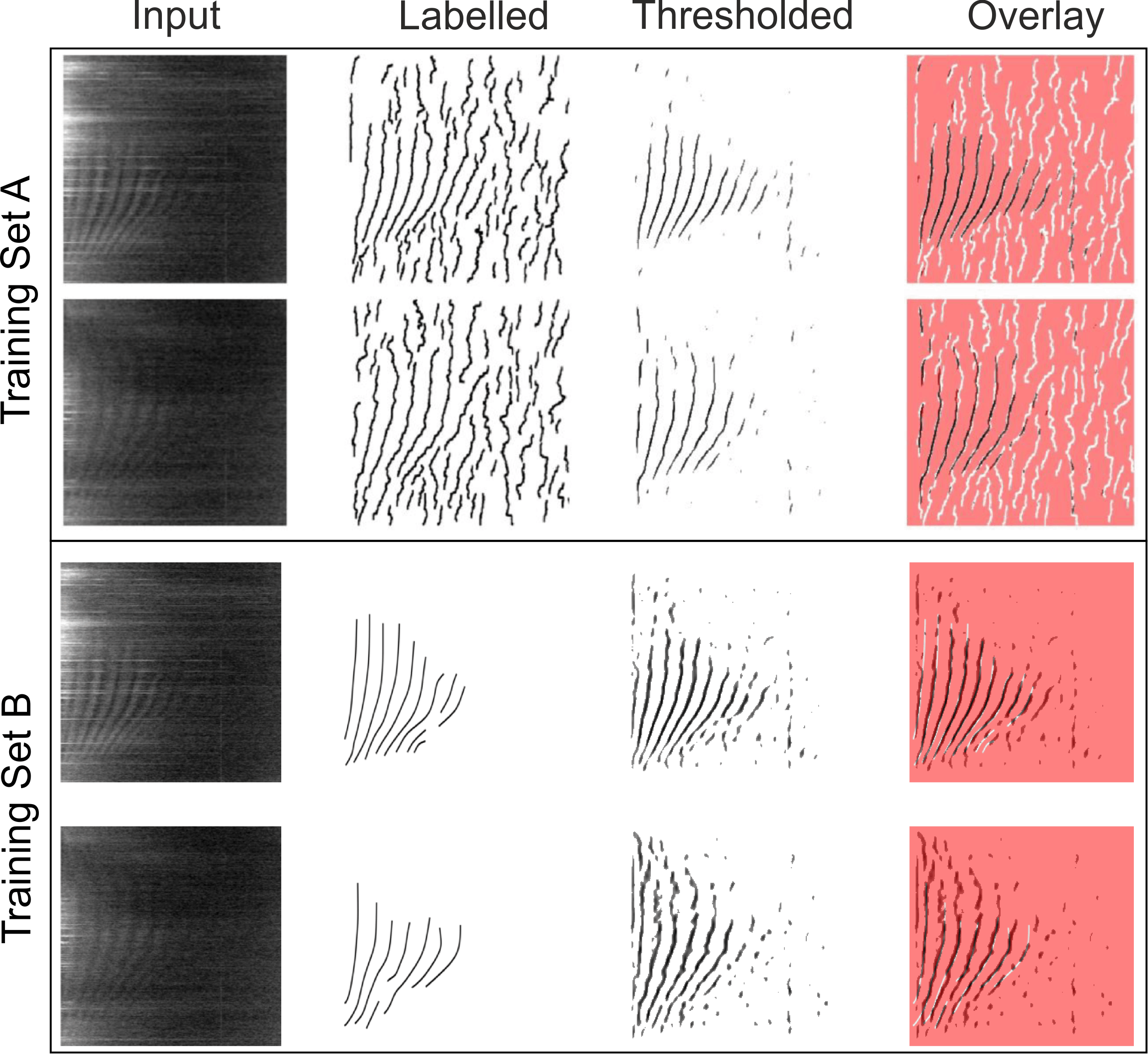
The IARs are generated by electromagnetic vibrations along field lines. Their parameters such as frequency and the gaps between each fringe provides information about the upper atmosphere such as density in an indirect manner. Extracting IAR data from the spectrograms automatically would be very useful. An initial attempt in 2014 using signal and image processing techniques was not overly sucessful and produced a large amount of false detections. In 2020, a new effort was made to use machine learning techniques instead. A convolution neural network known as U-net was adapted to segment out the bright fringes. Using around 180 manually or automatically labelled spectrograms, the U-net algorithm was trained up to detect IAR. It was very successful and, depending on the metric, was able to detect around 90% of the IARs. Just as importantly, it was also able to reject noise and correctly determine when no IAR were present.
Figure 7 summarises the results of the study. Training set A was the original signal and image processng method from the 2014 study. The Input spectrograms show the starting images. The Labelled images from training set A clearly pick out many lines which are IARs but also quite a lot of noise too. Training set B was a series of manually traced IAR using a graphics package, so these labels are much sparser and cleaner than A. Two U-net models were trained using these Labelled datasets and then tested on unseen spectrograms. The outputs in the Thresholded column show what U-net detects. The IARs are picked out very well, with clear noise rejection when the IARs are not visible. As the U-net outputs a probability map, this is thresholded to remove low values (i.e. unlikely to be an IAR). The rightmost panels show an overlay of the Labelled column and the U-net output. In the case of the manually-picked IAR (training set B), the match is excellent with few additional detections. Our next step will be to create an operational code for the U-net. Futher details are available from Marangio et al. (2020).
For more information please contact Dr Ciarán Beggan.
Acknowledgements
With special thanks to Gosia Musur for her efforts in processing and analysing data for publications (see Papers). We also thank Paolo Marangio for his work on developing the U-net algorithm to identify IAR in spectrograms.
- Global Geomagnetic Models
- Space Weather and Geomagnetic Hazard
- High-frequency magnetometers
- Schumann Resonances
- Geoelectric field monitoring
- Space Weather Impact on Ground-based Systems (SWIGS)
- SWIMMR Activities in Ground Effects (SAGE)
- Geomagnetic Virtual Observatories
- Quantum magnetometers for space weather
- Magnetotellurics
- Publications List
- Paper - Automatic detection of Ionospheric Alfvén Resonances in magnetic spectrograms using U-net (2020)
- Paper - Is the Madden-Julian Oscillation reliably detectable in Schumann Resonances? (2019)
- Paper - Observation of Ionospheric Alfvén Resonances at 1--30 Hz and their superposition with the Schumann Resonances. (2018)
- Automatic detection of ionospheric Alfvén resonances using signal and image processing techniques (2014)
